TechTurco WhatsApp ChannelOne-way channel: your number stays private
News
Severe backlash against YouTube Android app's new design: 92% of users want the old layout
YouTube is perhaps the least successful company when it comes to redesigns. According to a poll, the new interface designed for Android was not liked by anyone.
Contents
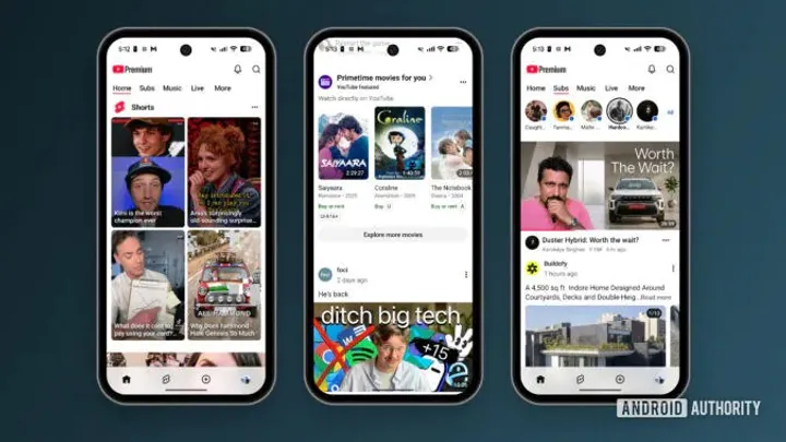
The new interface design that YouTube, operating under Google, began rolling out to Android users in November did not receive the expected interest. Although the interface update uses a new design language, surveys show that it has not been effective.
More than 92 percent of the 1,274 readers who participated in a survey conducted by tech media outlet Android Authority stated that they did not like the update and wanted the app to return to its previous layout.
92% of 1,274 survey participants disliked the design
The Android Authority team conducted a survey to gather readers' opinions following the changes made to the platform's Android version. In the survey with 1,274 total participants, an overwhelming majority responded negatively to the interface updates.
Reklam
According to the survey results, more than 92 percent of participants stated that they did not like the new design and requested that the Subscriptions tab be added back to the bottom navigation bar. The share of respondents who viewed the change favorably remained below 5 percent, while those who fully supported the update stood at only 2.1 percent.
A small portion of respondents stated that they had not yet received the update or were unaffected because they do not use YouTube on mobile devices.
Which features changed in the interface?
The November update released by YouTube includes several key adjustments that alter core in-app navigation habits. The primary interface changes introduced with the update are as follows:
Reklam
Be the first to know
Join our channel and get key developments straight on your phone.
TechTurco Telegram ChannelMute or leave any time
- Custom Feeds focus: Greater emphasis was placed on custom categories and algorithmic recommendations in in-app feeds.
- Subscriptions tab relocated: The Subscriptions tab in the main navigation bar at the bottom of the screen was removed from that position.
- Shorts emphasis increased: The short-form video platform Shorts was made more prominent in the interface.
- Filters feature removed: The Filters function in the new Subscriptions tab, which allowed users to filter content by type, was removed from the app.
- Posts button deleted: Another omission noted by readers in the comments section was the removal of the Posts button.
Which shortcomings do users complain about most?
Users reacting to the new design are dissatisfied with changes that disrupt their daily usage flow. In particular, the removal of the Filters feature is criticized for making it harder to access content from followed channels. In addition, the changes to the bottom menu and the removal of the button providing access to community posts are among the most frequently reported issues.
Personally, I do not view the new design so negatively. Even so, surveys indicate that the old design was better. It remains to be seen whether YouTube will revert to the previous layout. You can also share your thoughts on the new design in the comments below.
Reklam
This article was translated from Turkish. Read the original article in Turkish.
More in News